Dashboards are a great way to share data and company information in an easily digestible format. Every client we talk to wants dashboards, but it usually falls at the bottom of the priority list. Luckily, creating dashboards is not difficult and the video below walks you through building a dashboard.

Easy steps to follow:
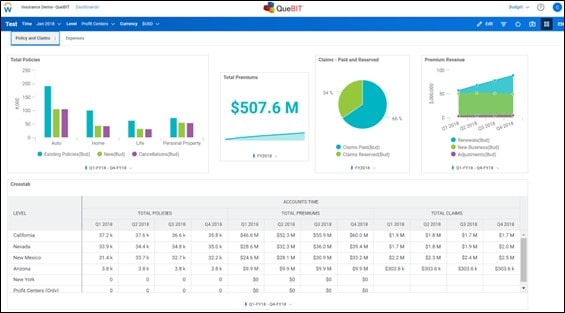
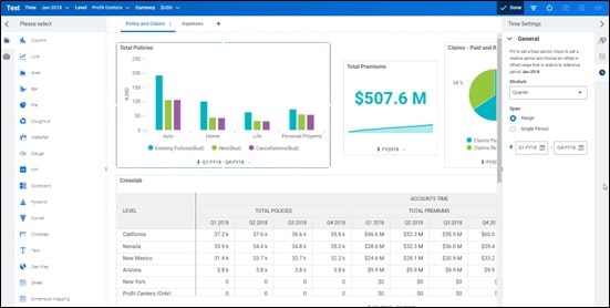
1. Determine the information you want to bring into the Dashboard. In this instance we determined Policy, Premiums, and Claims data would be interesting and useful.
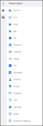
2. Drag and drop the charts you’d like to bring into the Dashboard.
In this example we bring in Column, KPI, Pie, Area, and Crosstab charts. There are many options shown on the left Charts menu.
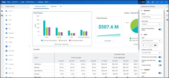
3. Edit the Titles, Data, and Time for each chart.
a. Appearance Settings let you change the Name, Axis, and Legend.
In this example we updated the name to ‘Total Policies’.
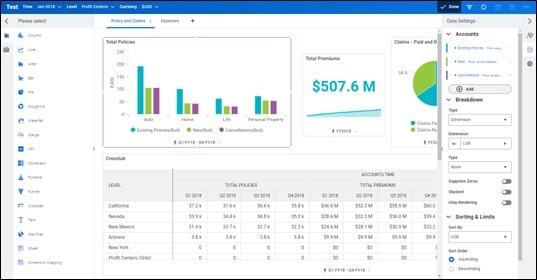
b. Data Settings let you pull in Accounts and determine the Breakdown.
In this example for columns, we bring in Existing Policies, New Policies, and Cancellations. We then determine to split by LOB dimension rather than time.
c. Time Settings let you update the time stratum you pull and determine if you want it dependent on the Time selection above or pin to a set time period.
In this example, we update the Time to pull 2018 data.
4. Resize and configure the charts to fit on a single screen if desired.