
The objective of this exercise is to demonstrate creating an Azure Data Studio (ADS) Notebook using Python to query SQL Server and investigate correlations between variables. Variable correlation can be key to increasing the accuracy of a forecast or predicting potential outcome scenarios.
What is an Azure Data Studio Notebook?
Azure Notebooks is a Microsoft Azure Platform as a Service (PaaS) offering of Jupyter Notebooks. A “Jupyter” Notebook is an open-source web application that lets you create and share documents containing live code, equations, visualizations, and narrative text. You can use ADS notebooks for data cleaning and transformation, numerical simulation, statistical modeling, data visualization, and machine learning (just to name a few).
Steps to create an ADS Notebook
To create an ADS notebook (from within Azure Data Studio), you simply select File, then New Notebook. Once you create a notebook, you’ll need to select a “notebook kernel” for the notebook to “use”.

What is a notebook kernel?
A notebook kernel is the “engine” that executes the code you add to the notebook. There are kernels for many languages available, for example the “ipython” kernel (listed as “Python 3”) executes Python code. By default, the SQL kernel (for executing T-SQL queries for SQL Server) is selected.
In this example, we’ll change the kernel to Python 3. Once you select Python 3, you will need to configure Python for the notebook, by selecting the option to use either an existing Python installation (if Python is already installed) or create a new Python installation (if you select this option, Azure Data Studio will perform the Python installation for you). Once you select a kernel and save the notebook, when you reopen the notebook, the associated kernel will be automatically launched and be ready for use.
Adding Cells
Notebooks consist of a series of “cells”. Cells can be either TEXT or CODE. A cell is essentially a section or “step” in a notebook. You can interleave code and text, but they are separate elements that format in whatever order you’ve placed them. Text cells allow you to easily document code in a notebook by adding “Markdown text blocks” in between code cells. Like GitHub, Azure Data Studio notebooks use markdown language for formatting text cells.
Let’s start building this notebook by adding a new text cell by clicking the +Cell command in the toolbar and selecting Text cell. The cell opens up in “edit mode” so you can type some (markdown) text. You can select either a rich text, markdown or “split view” (of the cell) to see as you type text, which helps you to get the formatting just right.
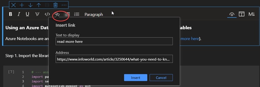
Linking to External Information
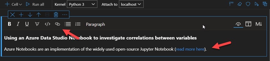
One of the “cooler things” about notebook text cells is that you can include a reference link within your text. So, for example, in the above image you can see that I’ve added a text cell with a heading and then underneath, an additional note about Azure Notebooks. Since my audience may not have used notebooks before, I have inserted a reference link to a web page where they can read more information about Azure notebooks. To add a link, you just highlight the desired text and click the link icon, where you can paste in the appropriate URL:
Code Cells
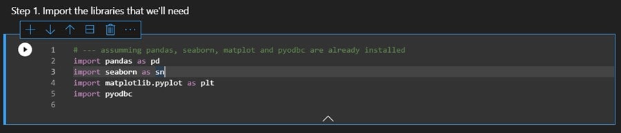
Notebook code cells allow you to enter and run program code interactively within a notebook. You add a new code cell by clicking the +Cell command in the toolbar and then selecting Code cell. Below, I’ve added a code cell to import the python modules that I want to use later in the notebook (note that I have already installed these libraries into my environment).
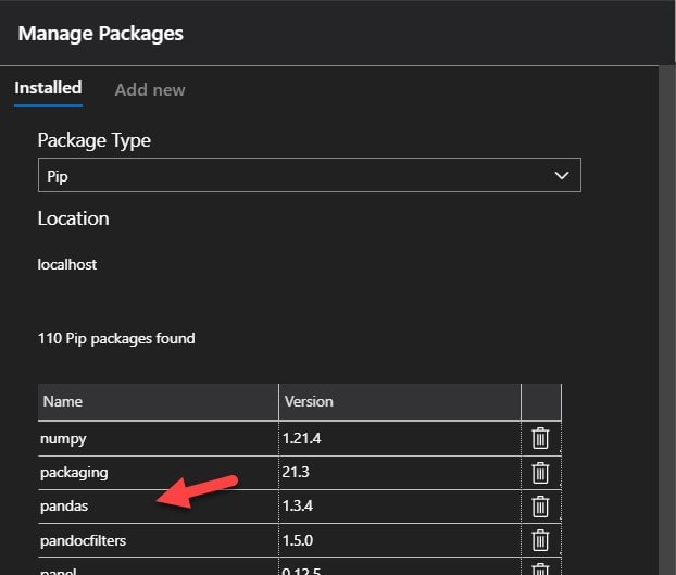
If you are unsure if a module is installed, you can click on Manage packages (shown below) and then view all of the installed packages or, install something new by click Add new:
Getting Data
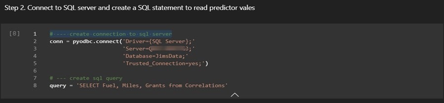
pyodbc is an open-source Python module that makes accessing ODBC (Open Database Connectivity) databases simple. Using pyodbc, you can easily connect Python applications to data sources with an ODBC driver. In the code cell below, since I know it’s already installed and we have imported it in the cell above, I’ve created both a connection to a SQL Server database named “JimsData” and a SQL command string to query a table named Correlations.
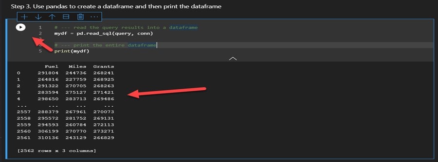
In the code cell below, I execute the SQL command, return the data into a pandas DataFrame object (named “mydf”) and, just for clarity, the DataFrame is then printed using the command print(mydf):

More Commentary
Even though I’ve added markdown text between each of the “steps” in my Azure notebook, notice that I always include a number of comments within my code cells, typically explaining each logical or functional purpose. Between the markdown and the code comments, hopefully everything is quite clear.
Running Some Code
To run a single code cell, you click Run cell (the round black arrow) to the left of the cell or select the cell and press F5. You can run all the cells in the notebook by clicking Run all in the toolbar. If you “run all” the cells are run one at a time and execution will stop if an error is encountered in a cell. The results (or outputs) from a code cell are shown below the cell. You can “clear” the results of all the executed cells in the notebook by selecting the Clear Results button in the toolbar. The image below shows the above code cell and its output (the printed DataFrame) below it.
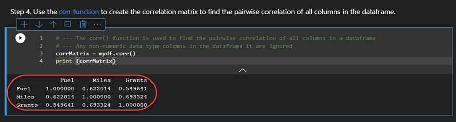
In the next step, I added another text cell with a link to documentation on the python “corr” function, which is then used in the code cell beneath it to create a correlation matrix – using the data sourced from SQL Server – which we previously loaded into a DataFrame. A correlation matrix is a table showing correlation coefficients between variables. Each value in the table shows the correlation between two variables. A correlation matrix is used to summarize data, as an input into a more advanced analysis, and as a diagnostic for advanced analyses.
Below is the text cell and then the code cell followed by its output.
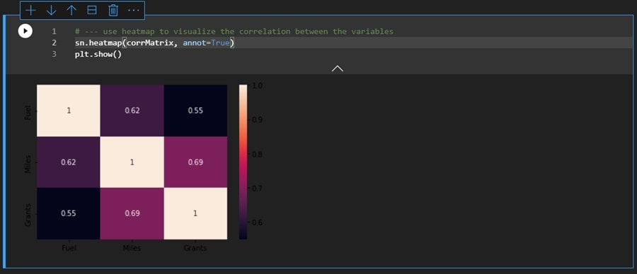
Visualizing the Correlation Matrix
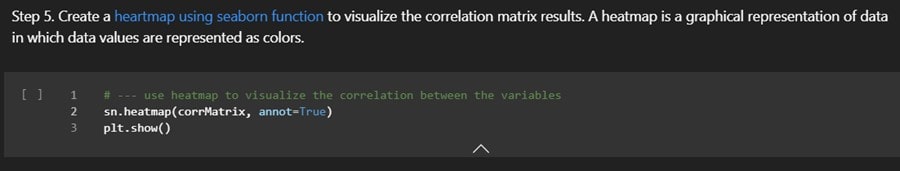
A heatmap contains values representing various shades of the same color for each value to be plotted. Usually, the darker shades of the chart represent higher values than the lighter shade. A heatmap is often a good choice to better illustrate the correlation between variables based upon a correlation matrix. Like the previous group of cells, below I’ve added a text cell referencing the seaborn heatmap function, followed by a code cell that implements that function using our generated correlation matrix (from the previous cell). The last line prints the heatmap.
Again, we can click the cell run button to see the output of this code cell which is a generated heatmap of variable correlations:
As a last step, I added a final text cell with a bit of a “conclusion”:

Final Thoughts
Azure Notebooks are a great option for sharing solutions to challenging problems since both working code and notes can easily be shared between individuals or teams for review, comment, and revision. Another valuable use case is to use Azure Notebooks to document a process or create a how-to guide for an important procedure.