
There are several design considerations when building dashboards, such as presenting information in a clear and concise manner, ease of navigation, and usability. Additionally, adding customizations to match your company profile and brand will help to embed analytics within your organization and provide a seamless transition from other applications with a matching look and feel. Luckily, IBM Planning Analytics Workspace (PAW) provides numerous options to do so.
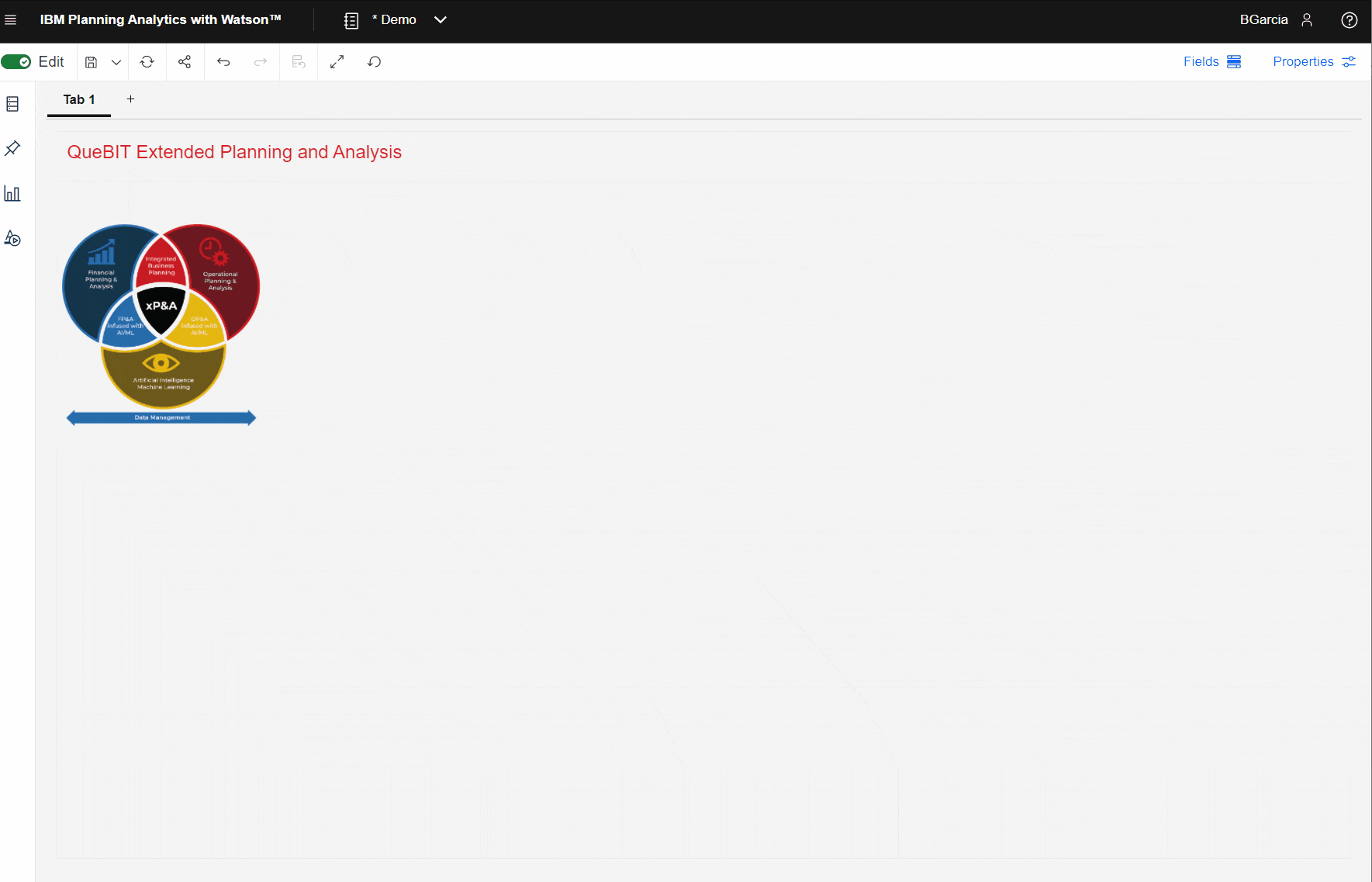
In this exercise, we will demonstrate building a customized PAW dashboard for QueBIT.
First, start with a blank PAW book.
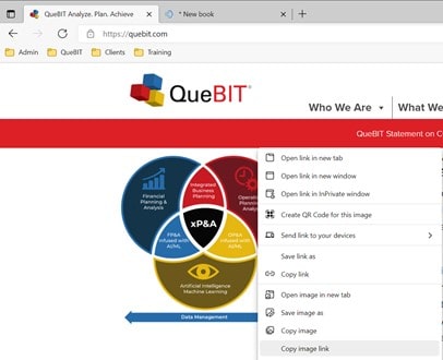
To incorporate your company logo and/or brand images, navigate to your company website, right click on an image, and click “Copy image link”:
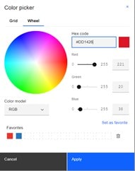
Next, determine the colors used on you company website by right-clicking on a colored object and then clicking “Inspect”.
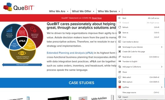
This will provide the exact RGB code for that color.
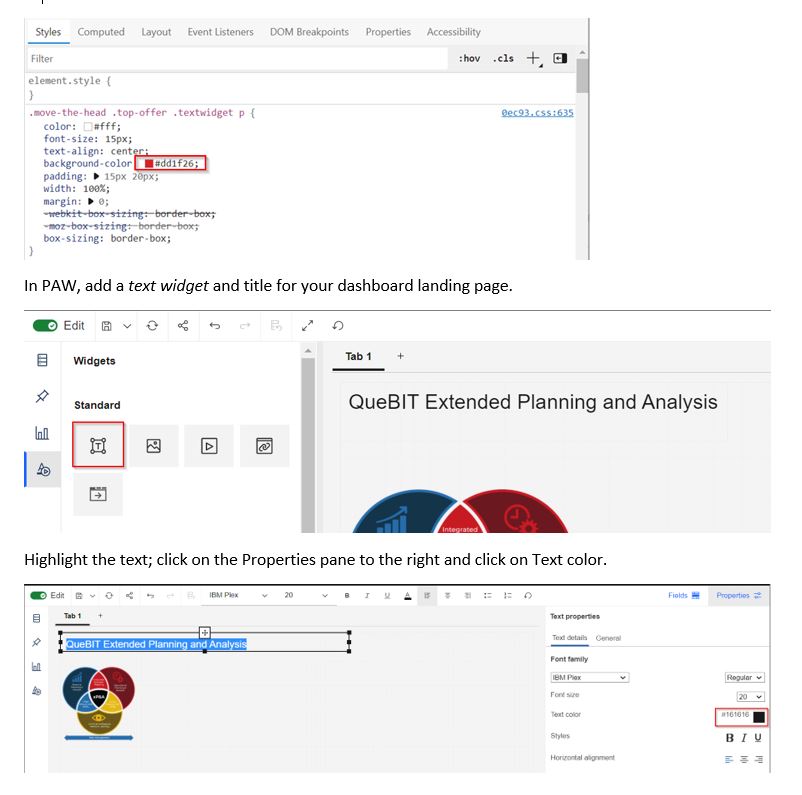
Update the Hex code to correspond with the RBG code pulled from the website. Click “Set as favorite” to be able to easily use this color again.
Now, pull the font that is used on the website, using the same approach (right click > Inspect)
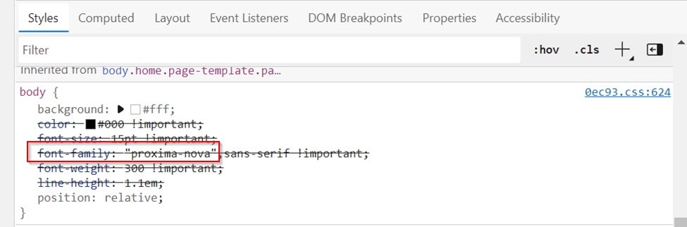
You can generally find and download most font packages through a simple Google search.
Once the font package is downloaded, we will import it to PAW through the Administration page.
Navigate back to the PAW book and the new font will be available for use.
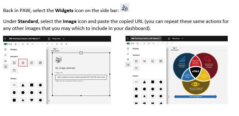
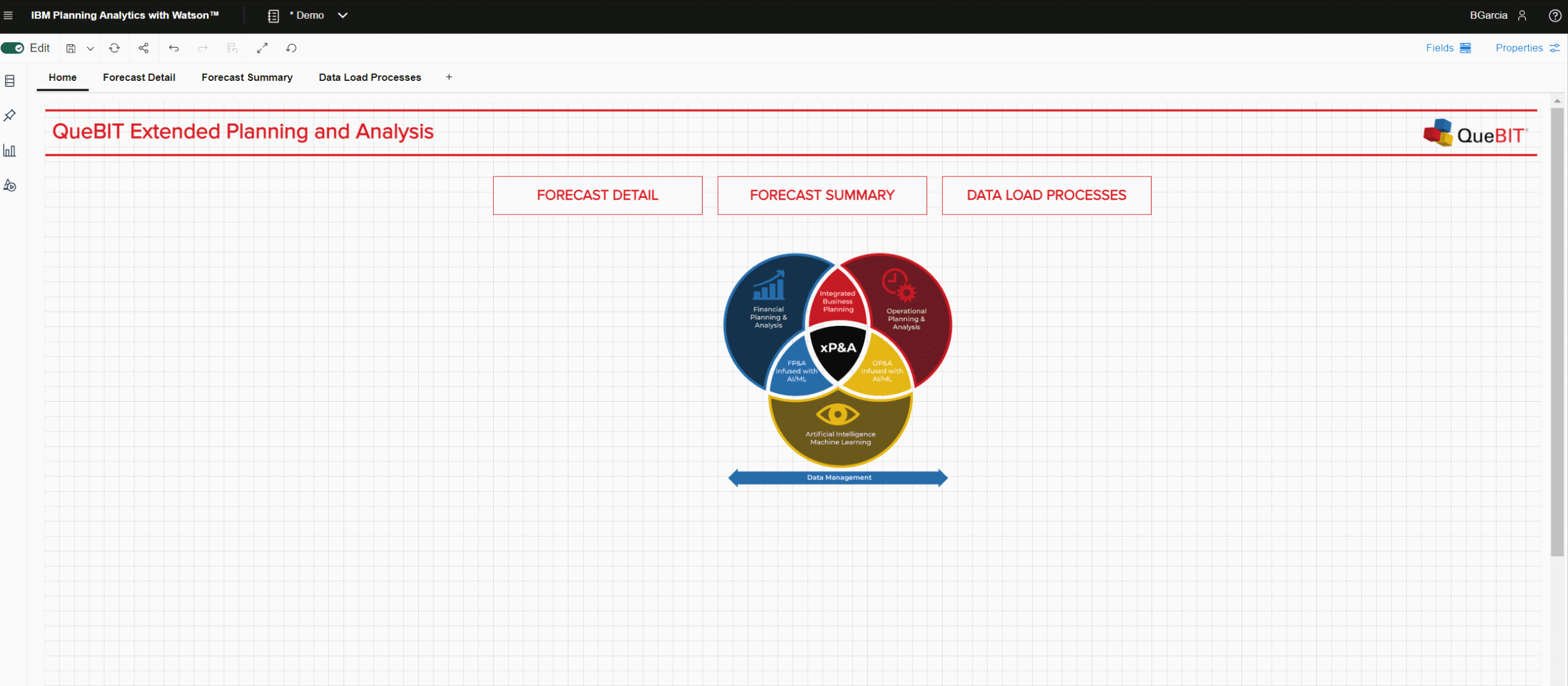
Now that the header is configured, group and pin the objects. This allows reuse of these objects on other pages and ensures consistency.
Last, but not least, create a custom color palette for any visualizations.
The best part of creating these customizations is that once the setup is complete, is it easy to apply to any of your dashboards. Happy branding!