Let’s get started with Dashboard basics… It’s easy!
Business Case:
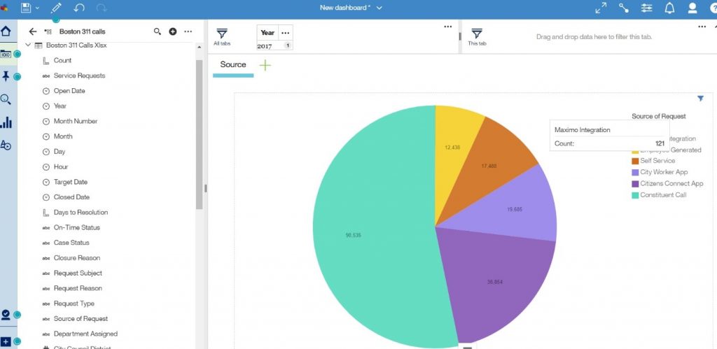
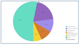
The City of Boston currently utilizes a “311 System”, which enables city residents or city workers to easily report non-emergency issues. Items such as broken streetlights or graffiti can be reported to the proper city services department via mobile phone applications, online, social media or a phone call. For this example, we would like to see what the most popular reporting method was for 2017 using a pie chart.
Procedure:
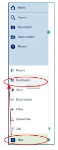
1 – On the Cognos Analytics home page, tap the New icon at the bottom of the window and click on Dashboard.
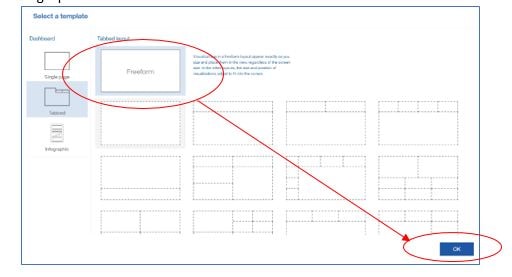
2 – You see predefined templates that contain grid lines for easy arrangement and alignment of visualizations and other elements in a dashboard. For this example, select the template with the single pane and then click OK.
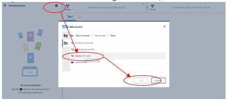
3 – Add the “Boston 311 Calls” data module to the dashboard.
- In the Data panel, click the plus icon to add a data source
- Under Team Content->Getting Started->Data, click on “Boston 311 Calls” and “Add”.
4 – Once you see the data items in the data pane, drag “Source of Request” onto the single pane and drop it on the square that appears in the pane.
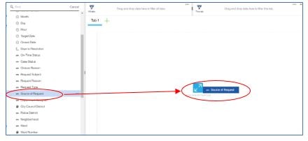
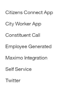
5 – You now see the list of sources.
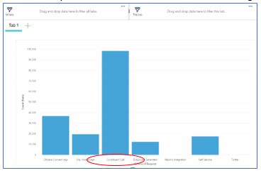
6 – Now drag “Count” to the canvas and drop it on the “Source of Request” list. In the column visualization, you see most of the notifications were through Constituent Calls.
7 – You can now change the visualization type.
- Click on any white space in the column visualization. A toolbar appears.
- Click on the Change visualization icon in the toolbar.
- Under More, choose the Pie Chart icon.

8 – You now see the same data as a pie chart.
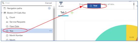
9 – To ensure you are only seeing data for 2017, drag “Year” to the filter box and choose 2017.
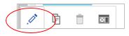
10 – Rename Tab 1 to “Sources” by clicking on the tab and choosing the edit icon.