
Pigment Data Slices
Data Slices are the key to streamlining reporting within Pigment. With many implementations utilizing Scenarios, Versions, and Snapshots, data slices allow you to create clear comparisons. This article will explain what Data Slices are and how to use them.
What are Data Slices?
Data Slices use a dimension to map two or more dimensions to without building separate formulas or metrics. In the example below we use a new ‘Reporting Version (Data Slices)’ dimension and map Version and Scenarios to that dimension.
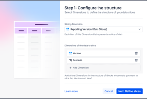
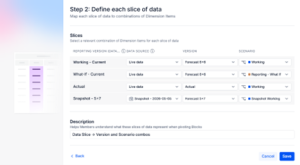
In the mapping we have four data slices, three using ‘Live data’ but sticking to specific Versions and Scenarios, one data slices pulls directly from a snapshot.
The result is the ability to view these data slices in boards and tables cleanly.
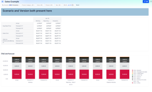
Before Data Slices:
Selections on Scenario/Snapshots and Version get you the information you want, but it’s not easy to do comparisons for the combinations that are most important or relevant.
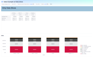
After Data Slices:
Select the ‘Reporting Version’ to compare easily in one clean pivoted view or chart.
Examples of Data Slice Use:
The example here uses Versions and Snapshots because this is the most common occurrence, but data slices can be built with any combination of dimensionality.
Other data slices that may be worth trying in an implementation:
- Year and Version -> Last Year Actuals vs Current Year Forecast
- Version alone -> standardize and limit the Snapshot and Version comparison visible
Tips and Best Practice
- Use Variables whenever possible in Data Slice definitions (‘Current Year’, ‘Current Forecast’ etc)
- Try to keep Data Slices dimensions small – the goal is easy user interface not to have every possible option available
- Data Slice dimensions and names are hardcoded, so keep them consistent and easily recognized. Would the team know what ‘LY Forecast’ means or is it better to use ‘May 2025 Forecast’?
- Slicing with snapshots keeps comparisons easy without turning on Scenarios