The objective of this exercise is to explore the use of Microsoft Power BI Desktop (version 2.98.1) to create a map visualization, so, let’s start by answering the question: what is a map visualization?
Map visualizations are used to analyze and display geographically related data and present it in the form of a map. This type of “data expression” is clearer and more intuitive since individuals can visually see the distribution of data by areas or regions making it easier to identify certain insights within that data.
Speaking of Data
As usual, the first step is to identify what data we want to map. The “what” is a measure and a context, such as revenue by sales region. In other words, we want to assess revenues generated by each sales region within an organization.
In this exercise, the data source is a Planning Analytics model where revenue is captured by customer over time. Since the goal is to map revenue by sales region, we need to perform a few steps so the data can be mapped:
- Introduce a state dimension. Since we intend on mapping this data, we need to be able to “connect” the data to a common “key”. Since our data is based upon customers which all have at least one physical address associated with them, we can use US state as our key. Since State didn’t already exist in our source system, we can introduce a state dimension, which simply lists all 50 state codes.
- Add state as an attribute to customers. Since revenues are stored in our data source by customer, we can add state as an attribute on the customer dimension. From there, using each customer address, we “map” each customer in the data base to the state where its corporate headquarters is located.
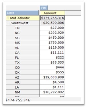
- Aggregate the data. To easily aggregate customer revenues (by state), we can create a repository (or reporting) cube and use a TurboIntegrator process to aggregate revenue from the customer level to the state level and then store it (in the reporting cube). The reporting cube (for now) has just 2 dimensions: state and reporting measures. The measures dimension will have “amount” as an element.
- Introduce the concept of sales regions. Since sales regions are groupings of states, we can add a sales region attribute to the state dimension. The sales region attribute will indicate which sales region the state is a member of. Using another TurboIntegrator process, we can create a sales region hierarchy in the state dimension. At this point, all our customers are mapped to a state and all states roll-up to a specific sales region!
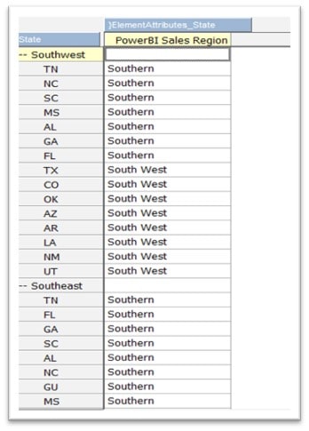
Partial View of Sales Region Hierarchy in the State Dimension
Extracting the Dataset
Since the idea of this exercise is to report “end-of-period” results (rather than fast moving and in real time) we can use another TurboIntegrator process to extract the data from our source system reporting cube to a CSV formatted text file, which then can be loaded into Power BI.
Partial View of simple reporting cube
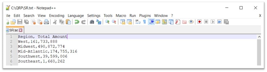
View of extracted CSV text file
Adding the data to Power BI
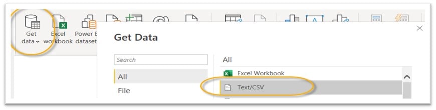
To use the data in Power BI we need to add it; to add the data to Power BI, you click on Get data and then select the data source type. Since we have a text file, you select Text/CSV:
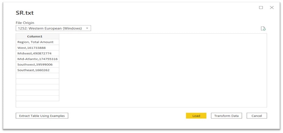
Next, click on Load and navigate to and select our text file. Power BI will “scan” the data and display a sample of it:
Transforming the Data
Even though the data is straight forward, as you can see, it’s not looking “quite” the way we expected. This isn’t a problem since Power BI gives us the opportunity to perform some basic transformations on that data before actually loading. Sometimes in Power BI you’ll see transforming data referred to as “shaping data”. Shaping data means the same thing as transforming the data: renaming columns or tables, changing text to numbers, removing rows, setting the first row as headers, and so on.
First, we can click on Transform and then “Split Column” (to use the comma as the column delimiter character) and designate the 1st row as the header row:
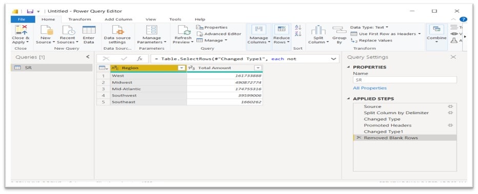
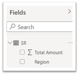
Since the data looks better now, we can click on Apply & Close which tells Power BI to apply the transformations to the data file and then load it into a Power BI model as available Fields shown here. SR is the name of our file, and the three columns of data found in the file are listed: Count, Total Amount and Region.
Mapping the Data
There are a number of Visualizations shown as icons on the Visualizations pane in Power BI, including two types of maps: the Filled Map and the ArcGIS Map. The Filled map visualization uses the Location value identified in data to create a map. Location can be a variety of valid locations: countries, states, counties, cities, zip codes, or other postal codes etc. At first thought, this seems like what we want but the Filled map uses predetermined locations (such as states) to display the data. Although our sales regions (in our database) are made up of multiple states as a single entity, the Filled Map visualization doesn’t offer a way to define those relationships or infer what states make up what sales regions.
The ArcGIS map is used to display data related to specific positions on the Earth’s surface. GIS can show many different kinds of data on one map, such as streets, buildings, and vegetation, but really can’t easily “group” positions into a single entity, such as a sales region.
Shape Maps
Fortunately, Power BI offers the Shape Map. Shape maps can be used to compare regions on a map using color. A shape map can’t show precise geographical locations of data points on a map (like ArcGIS maps), instead, its main purpose is to show relative comparisons of regions on a map by coloring them differently, perfect for this exercise.
Using the Shape Map
The Shape map visual is only available in Power BI Desktop and not in Power BI service or mobile. Also, it must be enabled before you can use it. To enable Shape map, you select File then Options and Settings then Options then Preview Features, and then finally, select the Shape map visual checkbox (you’ll need to restart Power BI Desktop after you make the selection). Once Shape Map is enabled, you can then select the Shape Map icon from the Visualizations pane and Power BI Desktop will create an empty Shape Map visual on the design canvas:
Using Custom Maps
Even with Shape maps we need to do a bit more work so that Power BI can “recognize” our Sales Regions from within our data. What we need to do is to create a “custom map” that includes sales region definitions. To do that, we need to start with a common a “shape file” and then convert it to TopoJSON format.
What is a shape file? A shapefile is a vector data file format commonly used for geospatial analysis. Shapefiles store the location, geometry, and attribution of point, line, and polygon features. A TopoJSON file format (an extension of geoJSON) is a format that “encodes topology”. This format contains both geospatial data (arcs) and attribute data (which “maps” the geospatial locations into regions). In contrast to other GIS formats, TopoJSON uses arcs which are sequences of points, while line strings and polygons are defined as sequences of arcs.
Bottom Line here is that a shape file will be the “map” that Power BI will use to translate geospatial data points (coordinates on a map) to a region name.
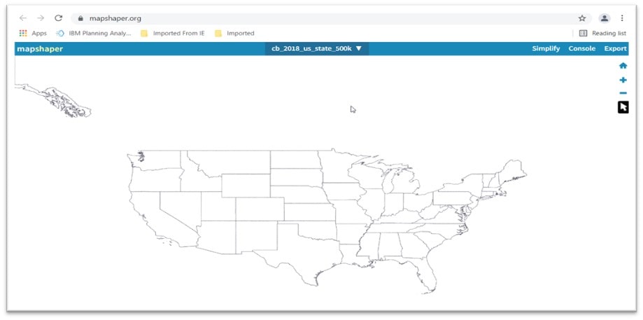
To create a TopoJSON file for this exercise, I started with a common shape file of US States (which is a free download from https://www.census.gov/geographies/mapping-files). I decided on this file since our visualization will be a map of the US and state outlines. Given these coordinates, Power BI will be able to take the coordinate and identify the state which then can be translated to the sales region that the state is a member of. This compressed file can be easily downloaded and then imported into an online tool (Map Shaper) where you can edit and then convert the shapefile into the required TopoJSON format.
Map Shaper
Map shaper is a free, open-source editor that can convert geospatial files, edit attribute data, filter, and dissolve features, simplify boundaries to make files smaller, and more. Below you can see the downloaded US states shape file imported into the Map Shaper desktop:
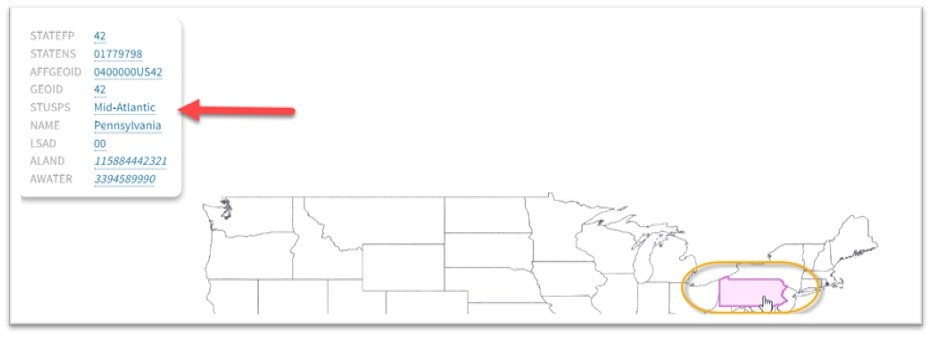
In Map Shaper, I discovered that I could click on each state and change the STUSPS data point to a common field name, in this case the appropriate sales region name that the state is a member of:
When all the states are assigned to a sales region, I then click Export and select the file format Power BI can understand (TopoJSON):
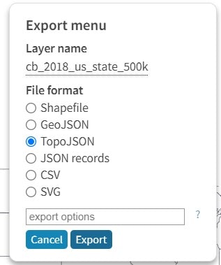
Map shaper then creates a custom shape file that I can import into Power BI.
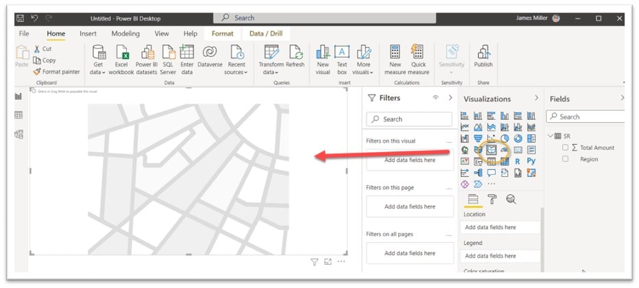
Adding the Custom Map to Power BI
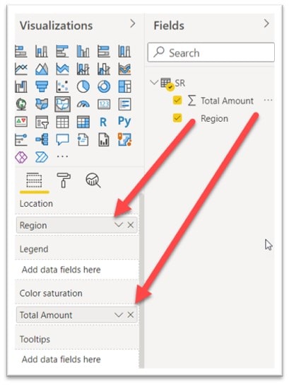
Back in Power BI I have already setup my visualization by dragging Region to Location and Total Amount to Color Saturation:
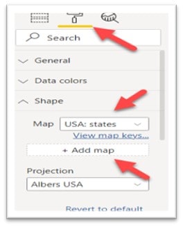
The next step will be to click on the Format icon and then scroll down to the Shape section where you will notice that the shape map listed is the default “USA: States”. We want to click on + Add Map, navigate to the file we exported from Map Changer, and select it.
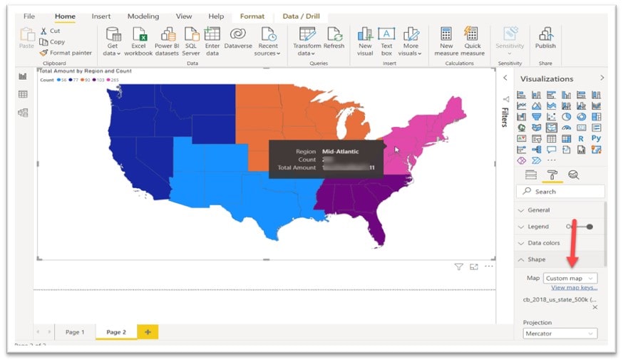
Once our custom map is loaded, viola! We have a very nice Sales Region map, complete with tool tips that are displayed when you hover over a sales region:
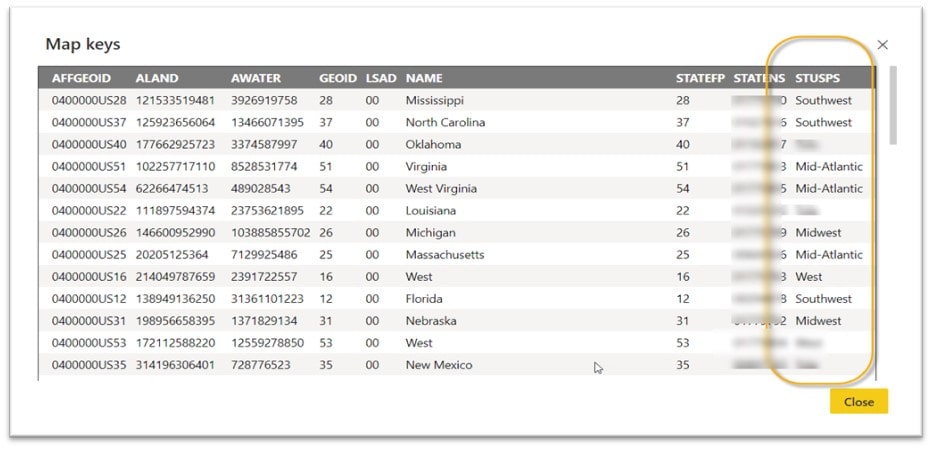
If you are curious, you can click on the link labeled View map keys and you will see the data in the custom map file we created: