
Using a Selector in Planning Analytics Workspace
A “selector” in IBM Planning Analytics Workspace (PAW) is a “widget” that lets you pick members, sets, or levels for a corresponding view of data. When a selector is synchronized with a view, what you pick (in the selector) is automatically applied to that view. For example, suppose that you have an Exploration View displayed in a PAW book and the overview (or context area) is hidden from sight. In this case, you can add a selector to the sheet so that you can click an item in the selector to filter the data in the view. There are two types of selectors: a selector list and a selector tile. In this exercise, I am going to create a selector list.
Create a Selector List from the Data tree
A selector list displays a full list of all members of the dimension or hierarchy from which it is created. You can click a member in the selector list to view data for that member in the view, but you cannot open the set editor from a selector list.
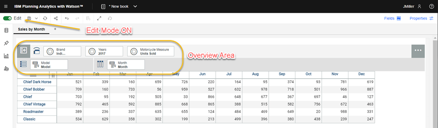
Starting with an existing PAW book, ensure that the book is in Edit mode. In my case I have an Exploration View showing my shops motorcycle sales broken out by brand, model and by month.
Notice that in this book the overview area is visible, but that’s okay for this exercise:
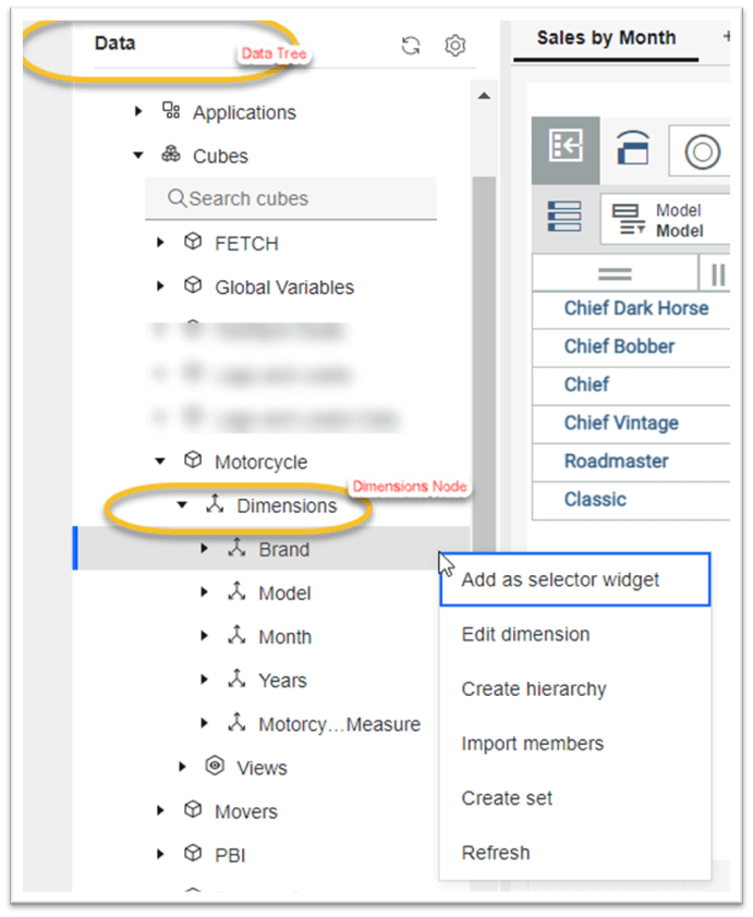
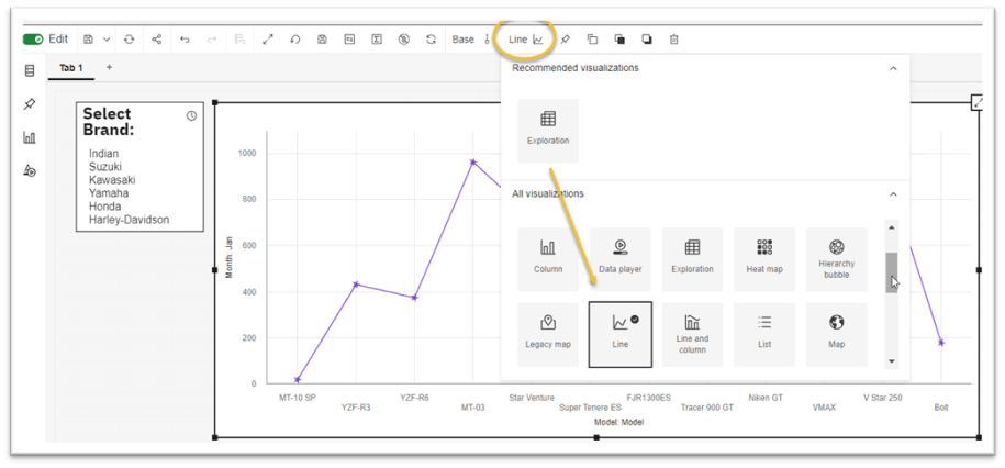
To add a Selector List, I first click on the Data tree and then open the Dimensions node beneath the cube I am working with and want to create a selector list for (note that you can only create a selector list from the Dimensions node beneath a cube not from the main Dimensions node). From there, I right-click the dimension I want to use as a selector list (in this case the “Brand” dimension), then select Add as selector widget:
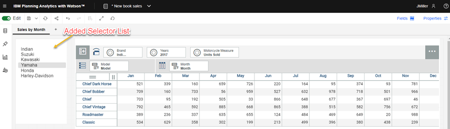
The selector is then placed on the sheet and displays the members in the selected dimension. You can move or resize the selector within the PAW book to make it look nice:
Now we need to do some simple “configurations”. For example, you can modify certain properties for the selector by clicking on the selector and then clicking Properties. I’ve decided to add a Title and Border to the selector:

You can also modify the refresh properties for the selector. For example, if you want the selector to automatically update when the associated dimension changes (recommended), you enable the Refresh automatically option. If you do enable this feature, don’t forget to also set the “refresh interval” which controls “how often” Planning Analytics Workspace will check the associated dimension for changes and then update the selector if needed.
Synchronization
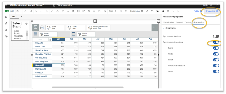
To make sure the selector list works correctly, you need to make sure that the view on the PAW book is synchronized with the selector. In other words, you want to make sure that when you change the selected value in the selector, you want to see the data displayed in the associated view filtered by that selection. To do that, you click on the view to select it and then click on Properties. Under properties, find the synchronize tab and then enable Synchronize dimensions:
Now, when you click on a Brand in the selector, the view of data will be refreshed to show sales filtered by month for each of the models for that brand.
More Configurations
There are many types of visualizations that can be created in Planning Analytics Workspace. Now that we have a selector working with our Exploration View, we can do a little experimenting with how the data is being presented. In this example I chose to change the visualization type from Exploration to Line Chart by again clicking on the view (to select it) and then changing the “Visualization Type” as shown here:
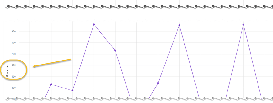
After changing the visualization type, the Selector List still works – selecting a different brand will change the data presented in the Line Chart – although changing the visualization type to a Line Chart changed the visible data from a full 12 months of data to a single month: January (as shown in the y-coordinate title):
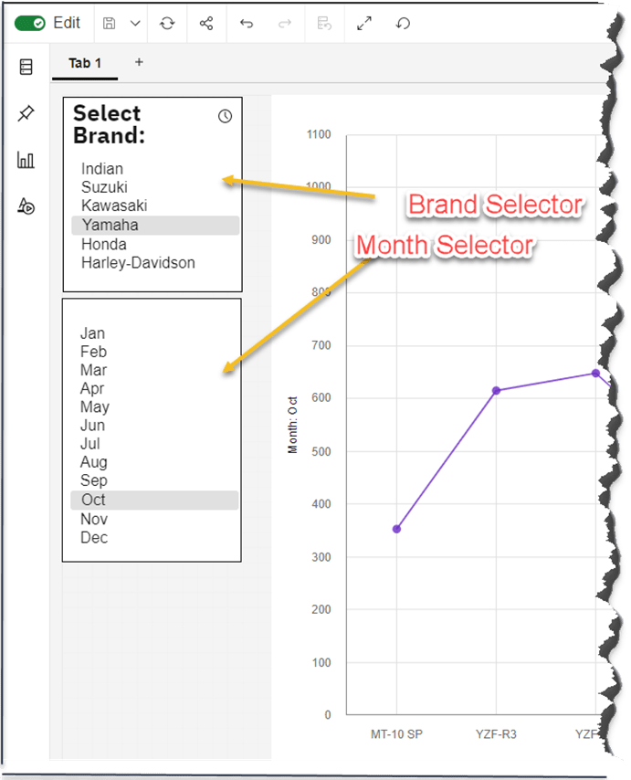
That “shift” to a single month is okay (for this exercise), but if we want, we can follow the above procedure again adding a second selector list, this one to filter on month, so that we can filter the data not only by Brand but also by Month:
Data Player Animations
Animating data can help to “bring it to life”. By animating a data visualization, one can engage viewers in different ways. Static data visualization, especially the unique ones, can be persuasive and help decision-making and animation (of the visualization) can enhance these advantages even further. In Planning Analytics Workspace, you can use the data player to create an animation of the impact of a data point. The data player selector includes a “Start/Pause” button along with a horizontal line with values from a dimension. Clicking start initiates the “animation” which will automatically “loop” trough each of the values in the dimension, causing the data in the synchronized view to automatically change.

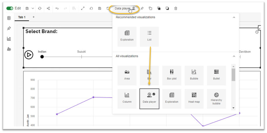
Using the data player is straight-forward; you simply click the selector and change its type to “Data Player” (you’ll also want to resize the selector to fit better):
To explore how your organization can create insightful data story visualizations using IBM Planning Analytics Workspace, contact QueBIT today. We would be happy to discuss your specific needs and explore the capabilities of PAW.