
Let’s add additional visualizations and create an interactive workspace.
In my last knowledge base article, “Creating a Simple Dashboard in Cognos Analytics 11.0.0+”, I covered how to easily create a single visualization depicting a key performance indicator (KPI). Taking this a step further, this article will show you how to add multiple visualizations to create an interactive workspace; allowing easy on demand filtering and the ability to dig deeper into underlying data giving even further insight on your KPI’s.
Business Case:
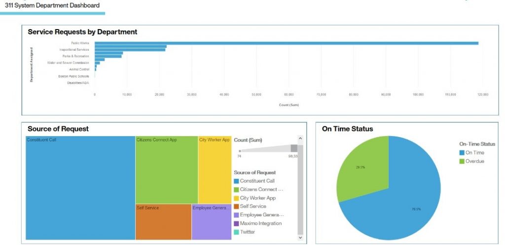
The City of Boston currently utilizes a “311 System”, which enables city residents or city workers to easily report non-emergency issues. As the Department coordinator, you need to monitor the number of service requests for the city. However, you also want to see the requests for each department, as well as the source of the request and on time status.
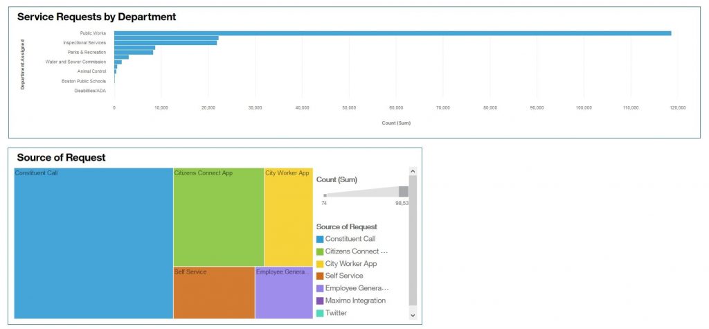
For example, the screen print below shows the information for all departments.
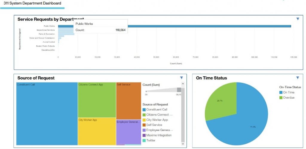
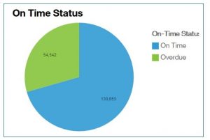
However, by clicking on the Public Works line, the “Source of Request” and “On Time Status” visualizations now show only the Public Works department information.
Procedure:
- Open the Dashboard created in the last Knowledge Base article, “Creating a Simple Dashboard in Cognos Analytics 11.0.0+”.
- Add a second visualization. This time, we are using a different method.
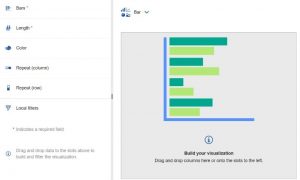
- Click on the Visualizations icon in the side panel.
- Click on the Bar icon.
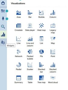
- An empty Bar Chart is created with empty data slots on the side, indicating where you need to add data.
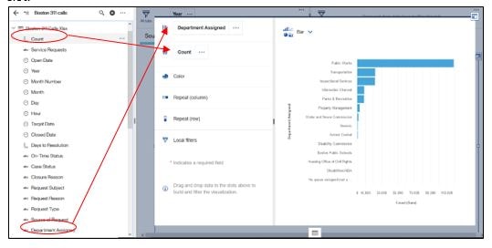
- Drag “Count” to the Bars data slot and drag “Assigned Department” to the Length data slot.
- Before closing the visualization, add a border to the chart.
- Click on the Properties icon
- Go to the General Tab and click on the Border color icon. Choose the border color you wish to use. For our example, we chose blue.
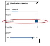
- Also, under General, click on “Show Title” and type Service Requests by Department.
- Close the visualization
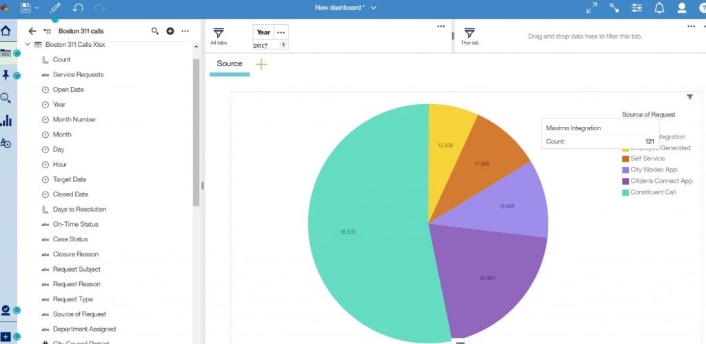
- Modify the original pie chart visualization and change it to a tree map.
- Double click on the pie chart visualization and choose the change visualization icon.
- Click on the Tree Map icon.
- Prior to closing the visualization, open the properties box again and add the border and title using the steps described above.
- You now are showing the number of service requests by department and how they were reported. Please note, the information will filter automatically by clicking on one or more data points in either visualization because both are based on the same data source.
- Following the same steps as #3 above, you can add the 3rd
- To change from count to %, open the properties icon and go to the Detail Tab. Click on the “Display %” icon.
- You now see the pie chart labels are showing % and no longer count.
- To complete the Dashboard, rename the tab header from “Source” to “311 System Department Dashboard”.