
Much of analytics is trying to decrease the amount of time and effort for converting data into valuable insights. Planning Analytics is a tool that does this very well. Since you’re reading this post, you are probably already familiar with Planning Analytics and web and reporting environment called Planning Analytics Workspace (PAW). PAW is great at not only providing a full web-based development environment but it’s also perfect for dash boarding. Dashboard can minimize time to discovery when consuming data for general audiences.
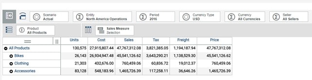
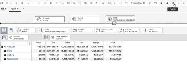
For example, let’s start with a basic cube view in PAW. This sample Sales cube allows users to pivot along dimensions and shows high level consolidated data. This cube view is great for more technical users who want to perform deeper analysis but some of the audience wants to review it with a glance.
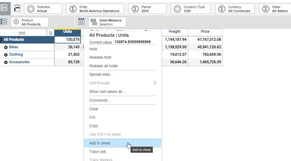
Using the original cube as a starting point, select a few data intersections from the report that are most important. With those intersections, right click and select Add to sheet.
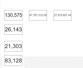
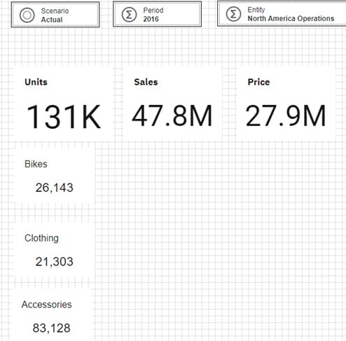
For this example, I have added the intersections that relate Units by product and Totals for Sales, Costs and Units.
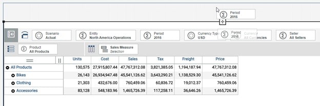
Some other tools that can be pulled from the original cube view are some of the title selectors. Click and Drag these to the canvas in background. You can release the click when the canvas appears with a blue outline.
With the intersections and selectors pulled from the cube view, the original view can be removed from the canvas. This can be done with click selecting the cube view and clicking the delete icon.
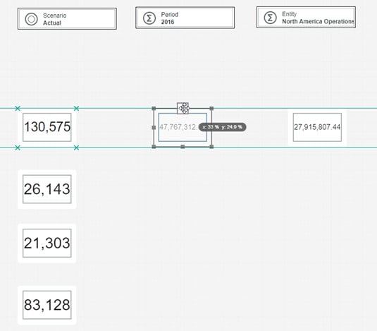
Adding these intersections to the sheet will show them as just the floating boxes where they can be arranged in whatever desired layout. The PAW canvas system is useful for helping align the position of the values with one another.
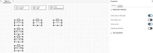
Each individual intersection box has properties which can adjusted to improve appearance or functionality. A couple options that are useful are to toggle on are: abbreviate numbers and toggle off “show as cell”. This will remove the line boarder of the cell for a cleaner appearance.
To keep track of what the numbers represent, you can select “Show title” from the properties options. For each box, click to edit the title as necessary.
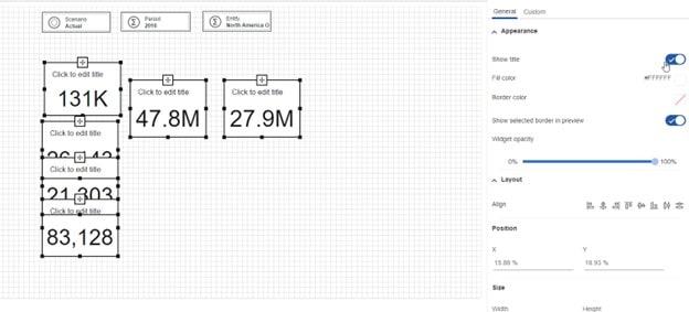
With the titles and abbreviated numbers added, it is much faster to digest the information.
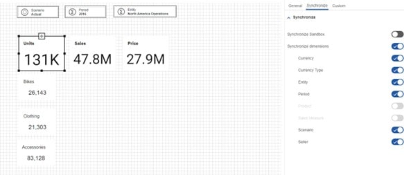
The last step is adjusting the synchronization setting for the book. This will ensure that the title selectors are synched for our data values.
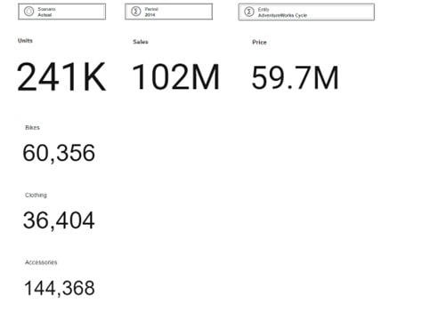
The final report should look like the image below. This presentation allows for a faster consumption of the key data pieces compared to our original cube view.
This is just one of many ways that IBM Planning Analytics can enhance your data experience.